Laudio
A six-week heuristic audit and redesign for frontline healthcare leaders: navigation, urgency, and a path back to one system.
Introduction
Laudio helps healthcare leaders act on frontline work. In six weeks the design had no single source of truth, labels drifted, and every card carried the same visual weight. The work was a heuristic evaluation, designer interviews, and a sharper reading order for the screens that matter.
Six high-severity heuristic violations were closed. Paths to primary workflows got shorter. The design-system fix was scoped for the next sprint, all inside 6 weeks.
6→0heuristic violations closed


The problem
Every task looked urgent.
Almost none were.
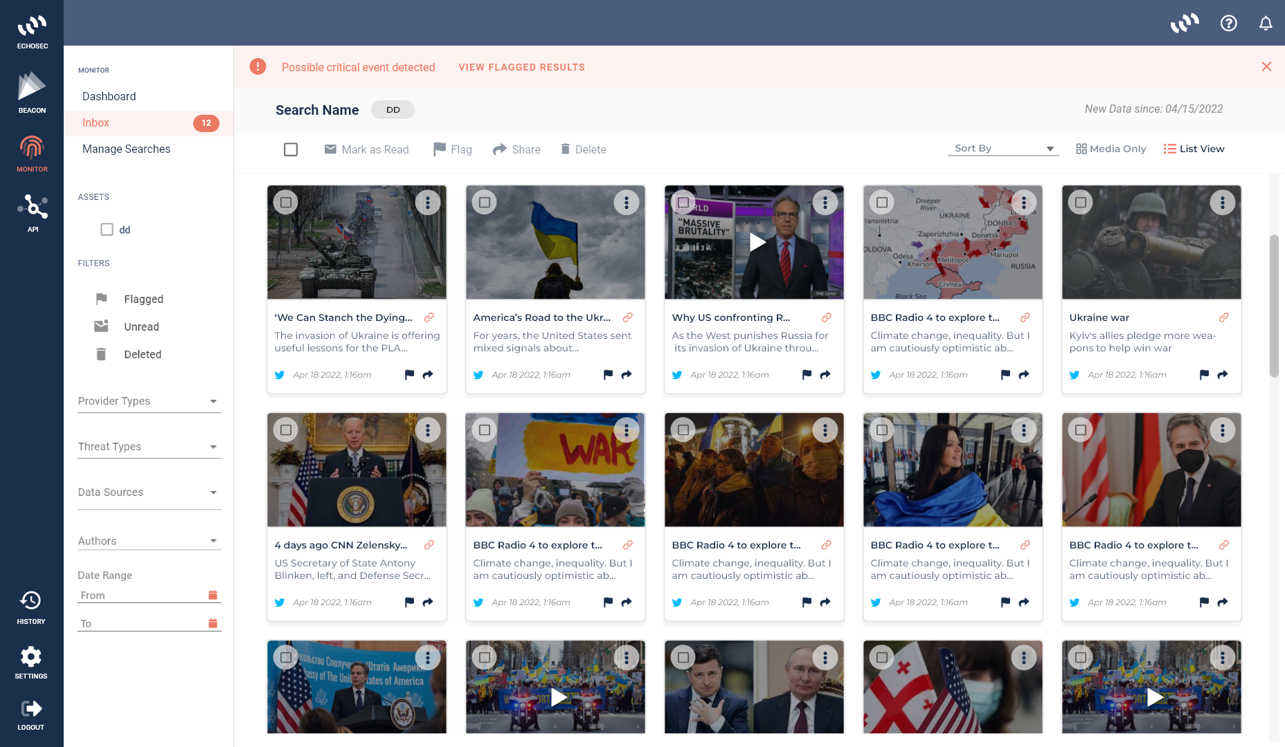
UI drifted across components because no one owned the system. Labels and hierarchy changed from screen to screen. Cards had no severity, so low action rates sat next to critical work at the same weight.
Audit
Violations catalogued by severity and cause
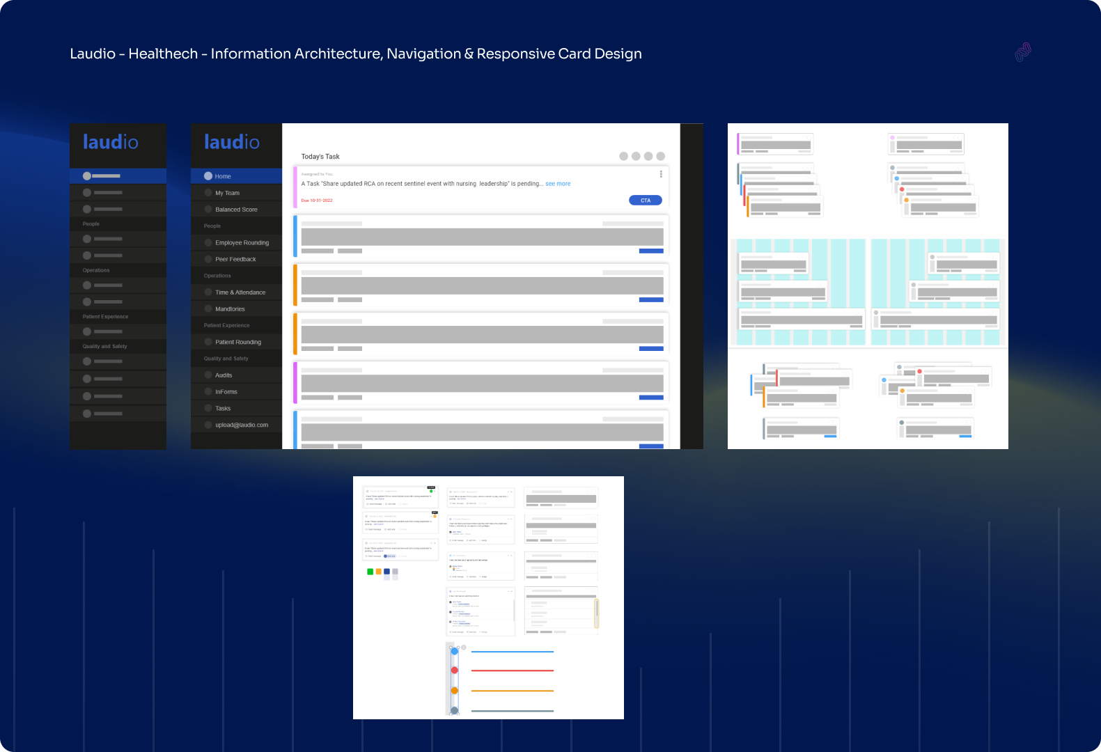
The heuristic pass named what was broken and why, so the redesign had a punch list instead of taste arguments.
Navigation
A reading order leaders can trust
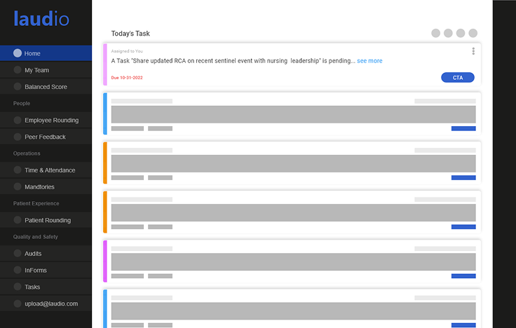
Primary workflows moved closer to the surface. Hierarchy and labels were aligned so the same action did not hide under three names.
Cards
Severity that shows up before you read
Cards carry urgency in color and structure. Low-action noise no longer competes with the work that needs a leader today.
System
Recommendations the next sprint can ship
Figma · Heuristic analysis · Designer interviews
Outcome
The outcome
- 6→0Heuristic violations closed
- 6Weeks, audit to redesign
- ↓Shorter paths to primary work
- 1System fix scoped next sprint
Leaders could finally see which cards needed them today, and which ones could wait.
Design review · Laudio · 6-week engagement
Building something
ambitious?
I partner with Web3, fintech, and SaaS teams to design flows that actually ship. Book a discovery call. No slides, just a conversation about your product.